Let's Get Started
You'll get the most value from financial planning if your specific goals and needs match a firm's philosophy and services. Let's learn more about each other.
Ready to Get Started?
Stock market concentration is more of a headline risk than a retirement risk.
Diversification across asset classes and geographies reduces the risks of today’s large-cap dominance.
Alternatives like equal-weight funds often add different risks and have historically underperformed long-term.
The current stock market concentration has been the subject of much recent press, analysis, and commentary. Companies known as the “Magnificent 7” have become so large that they now make up a larger portion of the stock market than we have seen in recent history.
Should today’s stock market concentration be a cause for concern for those planning for retirement today? In this webinar, originally done in August 2024, we look at today’s level of concentration, what risks it poses for investors, and why most alternatives don’t really reduce risk.
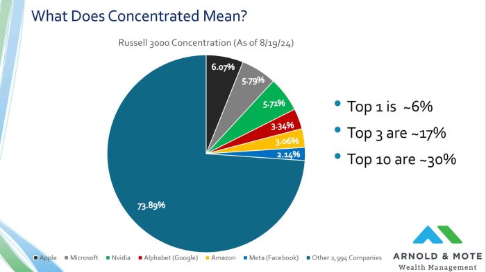
Just to make sure we are all on the same page with what we are talking about when we reference the concentrated stock market, here’s a look at the makeup of the Russell 3000 index as of the beginning of this week.
The Russell 3000 index is made up of 3000 companies, but that does not mean each company receives the same weighting in the index.
The Russell 3000, along with other well known indexes like the S&P 500, are market cap weighted, which just means that larger companies receive a larger allocation in the index.
Today Apple is the largest publicly traded US company, worth about $3.4 trillion. It makes up about 6% of the index. If you invest $1,000 into a Russell 3,000 index fund, about $60 goes into Apple.
So when you hear reference to stock market concentration, all it means is that these larger names are making up more and more of the index.
Today, the top ten names make up about 30% of the Russell 3000 index, which as we’ll see in a second is high relative to what we have seen in recent history.
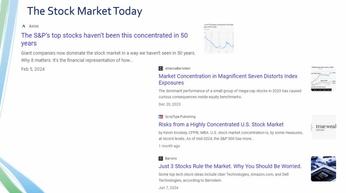
What are people saying about this today?
Fear sells! There’s a lot out there talking about how unprecedented this is, how it is distorting index funds, and why you should be worried.
We’ve had several questions from clients about this, so you are not alone at all if you have seen headlines like this and wondered if you should be concerned about any added risk to your retirement portfolio.
The next couple slides will show the data and charts that are commonly used to try and raise concern about today’s stock market. Then, we will follow up and show why we don’t think the data means you need to make significant changes to your investments.
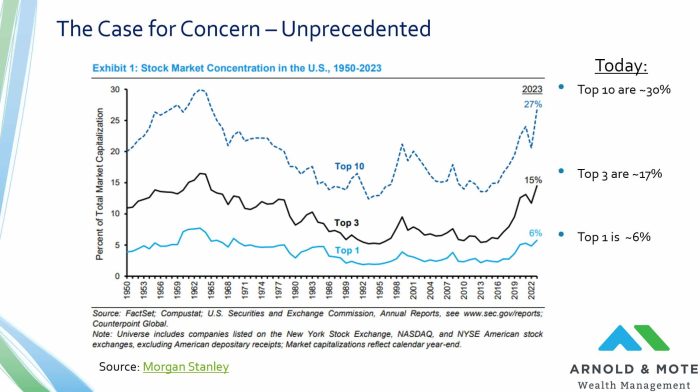
Most articles will lead with the data or a chart like this above, showing the US stock market concentration since 1950.
The y-axis here is that percent of the market and the different lines show the concentration for the top 10, 3, and 1 stock. For example, at the end of 2023, the top 10 holdings made up 27%.
This chart was from a paper in December 2023, so I put on the far right here where these percentages are today.
So you can see, it is true that especially for the top 10 holdings, their weightings are about as high as they have been over this time.
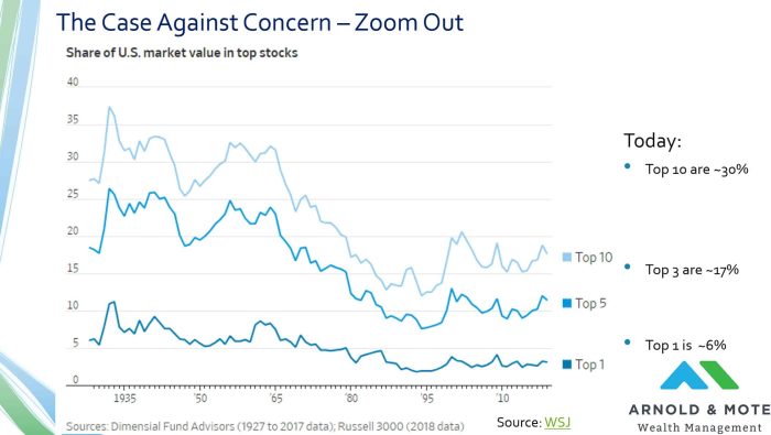
However, if we zoom out a little bit and use some longer term data, today’s numbers don’t seem nearly as unprecedented. This is a chart from a Wall Street Journal article 6 years ago – Which is a lesson in itself seeing that many people were ringing alarm bells on this 6 years ago!
And this data does back to the late 1920s, so another 30 years from the prior chart. What we see when we zoom out a little more is that we had almost a 30 year period where the market was as concentrated, and actually even more concentrated, than we are today.
And just to put some numbers behind what an investment in this period between 1928 and 1965 when the stock market was so concentrated – $100 turned into $3,000. So despite nearly 40% concentration in the top 10 names at one point, investors still faired pretty well even though the great depression was raging at the early part of it.
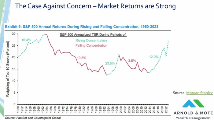
Besides looking at the performance of the stock market in those early years, this chart shows performance in that period from 1950 to now.
The y-axis is the weighting of the top 10 stocks, between 0 and 30%. The X-axis is the years from 1950 to now.
Green lines shows periods when concentration is rising, red when it is falling. And finally the numbers in the chart show the annual returns an investor would have had over that period.
A couple things to note:
The market has historically done very well when it is consolidating. So, this becomes an issue of market timing. Returns have historically been very good when concentration is rising, and we don’t know when that will stop. Returns may stay strong for 1 year or 10. If you sell out now, you may see high returns for many more years in the future before concentration begins to go down.
And then, even when concentration is going down, that does not mean investors suffer terrible returns. Consider this period of 1962 until 1992 when the market saw its largest deconsolidation in history, and investors still received over 10% annual returns for a 30-year period!
Just to put some numbers on that kind of return over a 30-year period. $1,000 invested at the peak of market concentration here in 1962 would have grown to $20,000 by 1992. A 20x return is not exactly something that you should stay up at night worrying about.
Do not necessarily think that if the market is too concentrated today and that if the concentration falls you will be in for a poor period of investment returns.
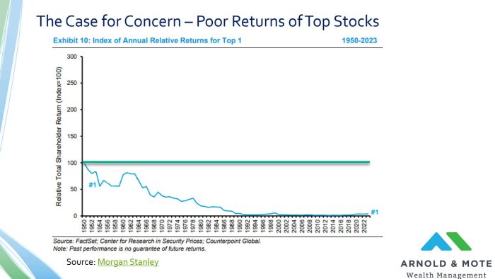
And the final main point in these articles talking about stock market concentration is that the top stock has a record of underperformance compared to the general market.
This chart here is one way to show that. This chart is showing the performance of the number 1 stock relative to the general market. So if you were invested in the entire market, just something like an index fund, you would see your performance be the horizontal green line here.
As you can see, the largest stock has pretty dramatically underperformed the general stock market.
So you see a chart like this and think, oh my gosh, I better not hold the #1 largest stock, right?
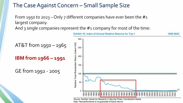
Well it turns out this chart is pretty deceptive, because there have actually been very few companies in history that have held this #1 spot.
In fact from 1950 to 2023, there was a total of 7 different companies that met that definition. And a few of these are companies that only held that position for mere months. There’s really only 4 companies in this list that have held this distinction for any considerable time.
In reality, what investing in the #1 largest stock really means is basically owning AT&T from 1950 to 1965, IBM from 1966 to 1991, and then GE from 1992 to 2005.
And what you can see from the chart above and the red box now added to the chart, is that really the only thing this chart shows you is that IBM was a poor investment in 1966. Almost all of the underperformance is just due to IBM’s fall from its peak in the late 1960s.
So whenever you hear reference about the underperformance of the top stock, what they don’t tell you is the sample size of this data is basically only 1 company.
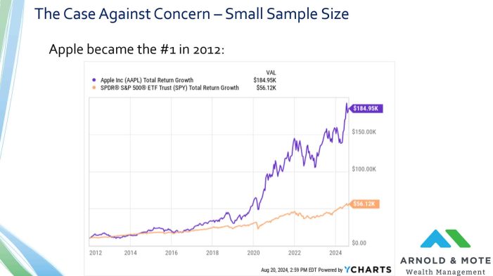
There is also one other company that has held the title of largest stock for a while, and that is Apple. Apple became the largest US company in 2012 and has kept the title for most of the last decade.
And it is worth noting that if you invested in Apple in 2012, you did pretty darn good. Much better than the general market in fact.
So if you were using that prior chart as evidence not to hold any Apple shares in 2012, you missed out on a significant portion of the stock market’s return.
$10,000 invested in the S&P 500 in 2012 turned into about $56,000 today.
$10,000 invested in Apple in 2012 is worth about $185,000 today!
Besides looking at specific performance, there’s a few other issues with the argument of today’s stock market concentration being concerning.
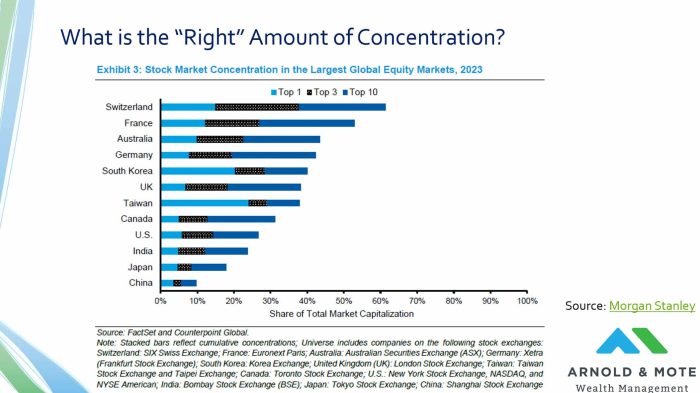
One is that while we can say the US stock market is concentrated, many other developed countries have stock markets that are even more concentrated.
Today the top 10 holdings in the US make up about 30% of the market, but countries like Switzerland, France, Australia, and Germany are at concentration levels of 40%, 50% or more.
You can certainly be correct in pointing out that today’s concentration levels are higher than they have been recently. But there really is no answer about what the “right” amount of concentration is.
There are examples here of more or less concentrated markets having good long term returns.
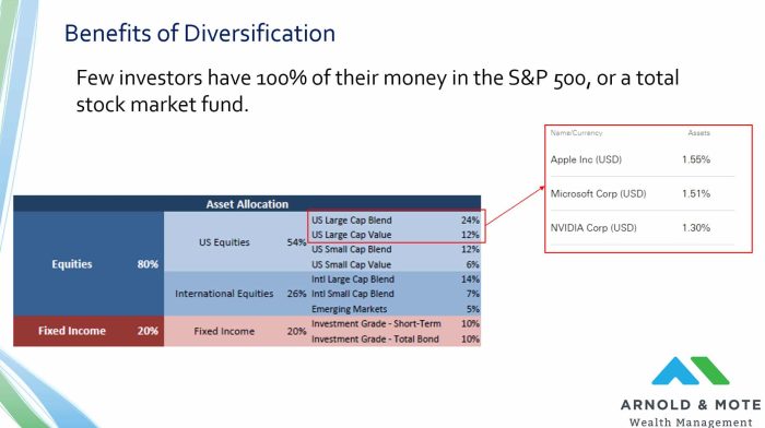
And probably the biggest point in the entire webinar is that unless you have all of your money in an S&P 500 fund, or a total stock market fund, today’s stock market concentration becomes a non-issue.
For example, I took a sample allocation that is 80% stocks and 20% bonds, that is diversified between large cap stocks, small cap stocks, international stocks, and some bonds. Even this very simple asset allocation leaves you with Apple being about only 1.5% of your portfolio.
Like so many of the risks we talk about with investing, diversification is the best way to reduce risk in your portfolio. And this is just another example of that.
If Apple does end up becoming another IBM, being diversified will protect you from that.
Finally, we wanted to highlight one solution being presented to investors on this issue, and that is something called equal weight funds.
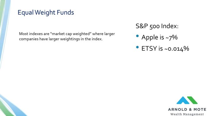
To understand how these are different, you need to first understand how most stock market indexes are set up. Most are what is called market cap weighted, which is just what we have been looking at with the Russell, or the S&P 500. The larger companies have the largest share in the index.
So I show on the right here the largest company in the S&P 500, which is Apple at about 7% of that index. And one of the smallest holdings, ETSY, which makes up just over one one-hundredth of a percent of the index.
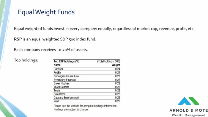
Equal weight funds work a little differently. Instead of the variable weightings of each holding, every holding is allocated the same percent. So in the case of an S&P 500 equal weight fund, each of the holdings gets about 0.2%.
There is an ETF with the ticker symbol RSP that I believe is the largest equal weight fund out there today. The fund has nearly $60 billion in assets, so this has been incredibly popular with investors recently.
Shown here are the top holdings for the fund, but really every holding is initially set at about 0.2% of the portfolio, and then goes up and down in between the periods it is rebalanced.
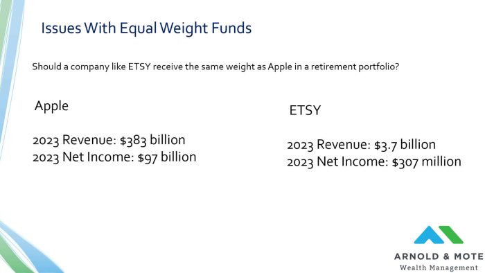
Equal weight funds are typically sold as the solution to the market concentration issue. But they hide that they present another big risk, and that is a pretty big overweight allocation on much less profitable companies.
Shown here is the revenue and net income of Apple and ETSY.
Apple is just a monster, right? Last year they had almost $100 billion in net income.
Now ETSY was profitable as well, but not nearly as so. Apple basically makes in 1 day what ETSY makes in 1 year.
And so I think anyone, and any retiree in particular, considering equal weight funds should ask themselves – If a company like Apple being the largest portion of your portfolio is so bad, why is replacing the most profitable company in the US with companies with much less history of profitability really a better option?
We have seen a time when stock market concentration was due to really unprofitable companies, I’m thinking specifically of the dot-com bubble here. But that is not the case at all today.
The largest companies today – Apple, Microsoft, NVIDIA, Facebook, and Google, have hundreds of billions of dollars in profits.
You have to invest somewhere, and I think it is a little bit crazy to say that ETSY should be the largest holding of any retirement portfolio.
Is apple at 6 or 7% of your portfolio a risk? Sure I guess it is. But a 20x higher allocation to ETSY is also a risk, and perhaps an even bigger one.
And finally, besides that issue, there is some in the structure of the stock market and equal weighted funds that makes them inferior.
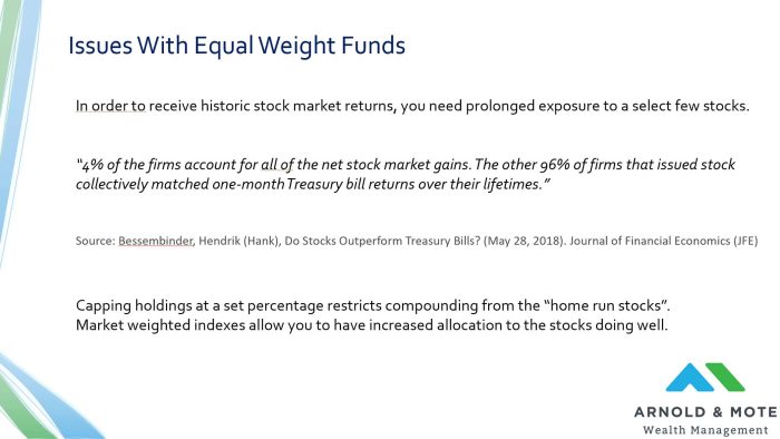
When you look at the stock market, by in large the returns an investor receives is due to very few companies that do exceptionally well.
There are some great studies on this, and I am quoting one here that looked back at historical stock market returns, and they found that just 4% of companies have been responsible for the entire returns of the stock market. This is the Apples, the Exxons, the Googles, etc.
96% of stocks that have existed have produced collective returns that hardly beat an investment in a US Treasury bill.
What this means for an investor considering an equal weighted fund is that if you restrict your holdings to those 4% of companies that do exceptionally well, in the end you ultimately can not get historic returns in the long run.
Historic stock market returns have only come from investing in the very few home run companies and letting your investment grow and compound over time. It is from letting Apple grow from .1% of your portfolio to 7%.
Equal weighted stocks just can not create long term returns for investors if the stock market continues to operate like it has over the last 100 plus years.
And we have seen some of these issues impact the performance of equal weighted funds.
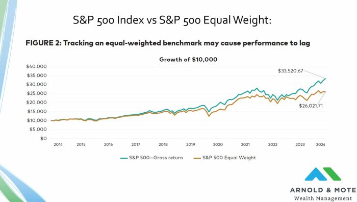
This first chart is from a Vanguard research paper on equal weighted funds, showing the performance of an S&P 500 equal weighted fund vs a regular market cap weighted S&P 500 index fund:
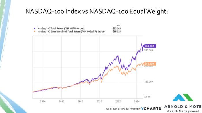
Then we also see the issue in more concentrated indexes, like the NASDAQ-100. The performance of the NASDAQ-100 equal weight index has dramatically underperformed the market cap weighted option:

Matt worked for the Department of Defense as a material scientist before changing careers to follow his interests in personal finance and investing. Matt has been quoted in The Wall Street Journal, CNBC, Kiplinger, and other nationally recognized finance publications as a flat fee advisor for Arnold and Mote Wealth Management. Arnold & Mote Wealth Management is a flat-fee, fiduciary financial planning firm serving individuals and families in Cedar Rapids and surrounding areas. He lives in North Liberty, where you will likely find him, his wife Jessica, and two kids walking their dog on a nice day. In his free time Matt is an avid reader, and is probably planning his next family vacation.